Solheim Cup Logo
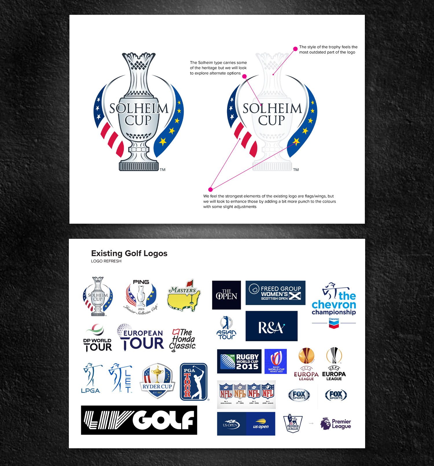
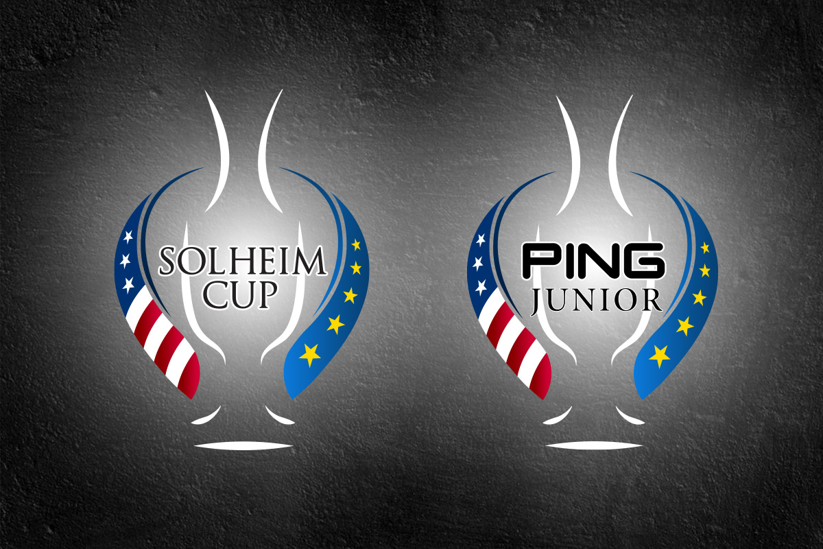
The goal of the redesigned Solheim Cup logo is to honor the rich history and prestigious legacy of this iconic event while introducing a fresh, modern interpretation that resonates with contemporary audiences.
Software
Illustrator
Client
Solheim, Ping
Services
Design
Project
Creative
Description
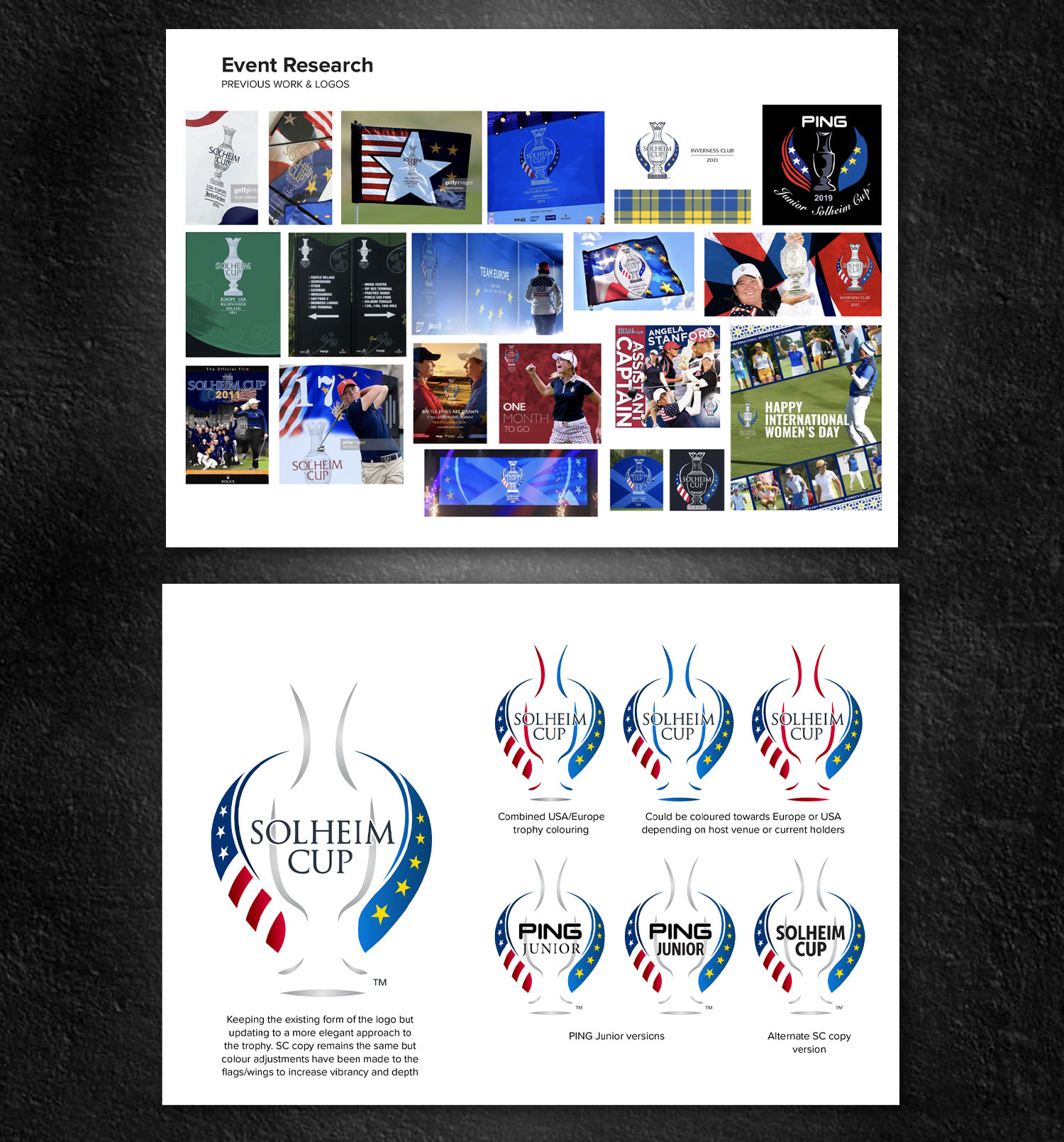
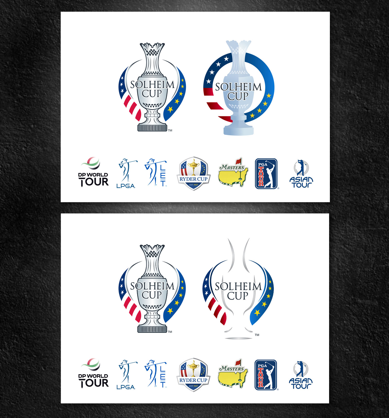
We sought to achieve a balance between tradition and innovation, drawing inspiration from key elements of the existing logo and the tournament’s symbolic trophy. By incorporating these elements, we ensure that the design remains rooted in the tournament’s heritage, yet also feels relevant and forward-looking.
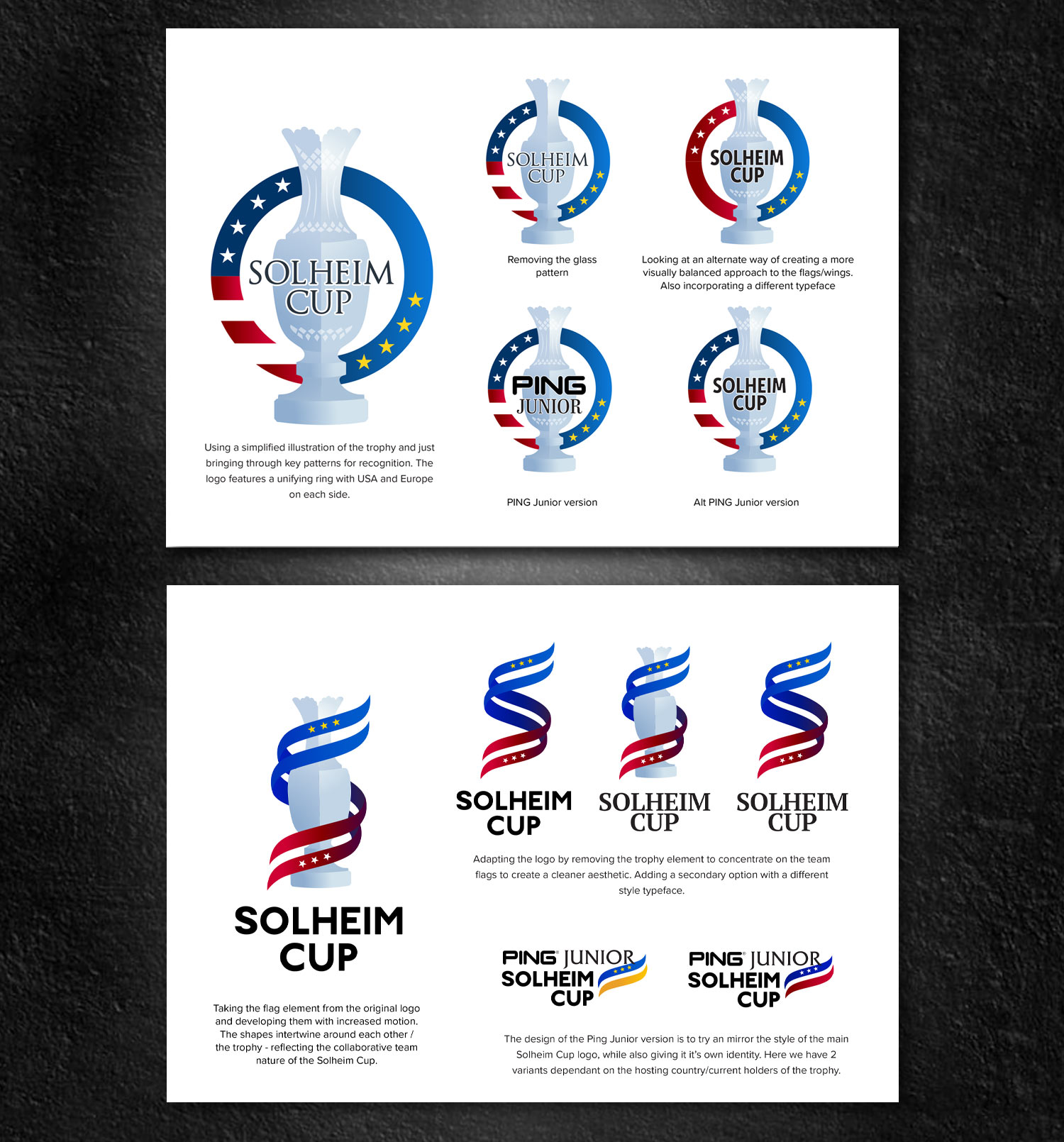
The trophy itself, with its intricate details and prestigious aura, served as a primary visual reference. We took particular care to highlight its sense of craftsmanship, elevating its stature within the logo’s visual identity. At the same time, we embraced clean lines and simplified forms, creating a more streamlined and dynamic representation that feels current, energetic, and capable of standing out in a competitive sports landscape.
In essence, this redesigned logo celebrates the Solheim Cup’s prestigious past, while positioning it for future generations. It’s a symbol that both honors its roots and looks boldly toward the future, encapsulating the spirit of competition, camaraderie, and excellence that has always defined the Solheim Cup.